

Case Study
IBM z/OS Debugger Code Coverage
An all-in-one reporting solution—giving developers actionable insights to deploy reliable code with confidence.
Details
Client
IBM Canada Ltd.
Year
2023
Role
UX/UI Designer
Team
Heny T. (Project Lead), Alan B. (Architect), Samantha C. (Senior Software Engineer), Brian H. (Software Developer), Theresa R. (UX Researcher), and Jason E. (UX Designer)
Details
IBM Code Coverage enables you to test your application and generate information to determine which code statements are executed.
Background
The code coverage tool is an advanced application analysis tool that provides the ability to create reports detailing testing efficiency and risk metrics for mainframe programs. The code coverage function enables you to test your application and generate information to determine which code statements are executed.
In 2023, the IBM zSystems code coverage team came together to redesign the software and address the following problems.
Outdated Design System
Since code coverage’s initial release over a decade ago, IBM has created Carbon, a design system for products and digital experiences. With code coverage having an outdated and standalone design, teams encountered issues creating, replicating, and maintaining the tool’s design.
As a result, the amount of time and budget to upkeep the tool steadily increased year by year.
Usability Issues
Currently, code coverage resides in the maturity phase of the product life cycle. Consequently, the assessment of its user experience and interface has diminished over time. With the constant evolution of technology and user behaviors, we discovered that formerly favored design options have become obsolete or led to inadequate user experiences.
With that in mind, we wanted to repeat and refine our design approach and tools, adapting them to the changing user needs and business goals.

The Framework
Design thinking is a human-centered, iterative approach to problem solving.
Background
We implemented IBM Design Thinking, a scalable framework to help our team understand and deliver — continuously.
User Interviews
Empathy begins with getting to know people as people, not just as users. We began by setting up user interviews to validate existing features and asked open-ended questions to learn about how people typically interact with the platform.
We hosted four sessions, two with internal IBM teams and two with customer teams. Each team that we interviewed consisted of several representatives who had the most technical and working knowledge of code coverage.
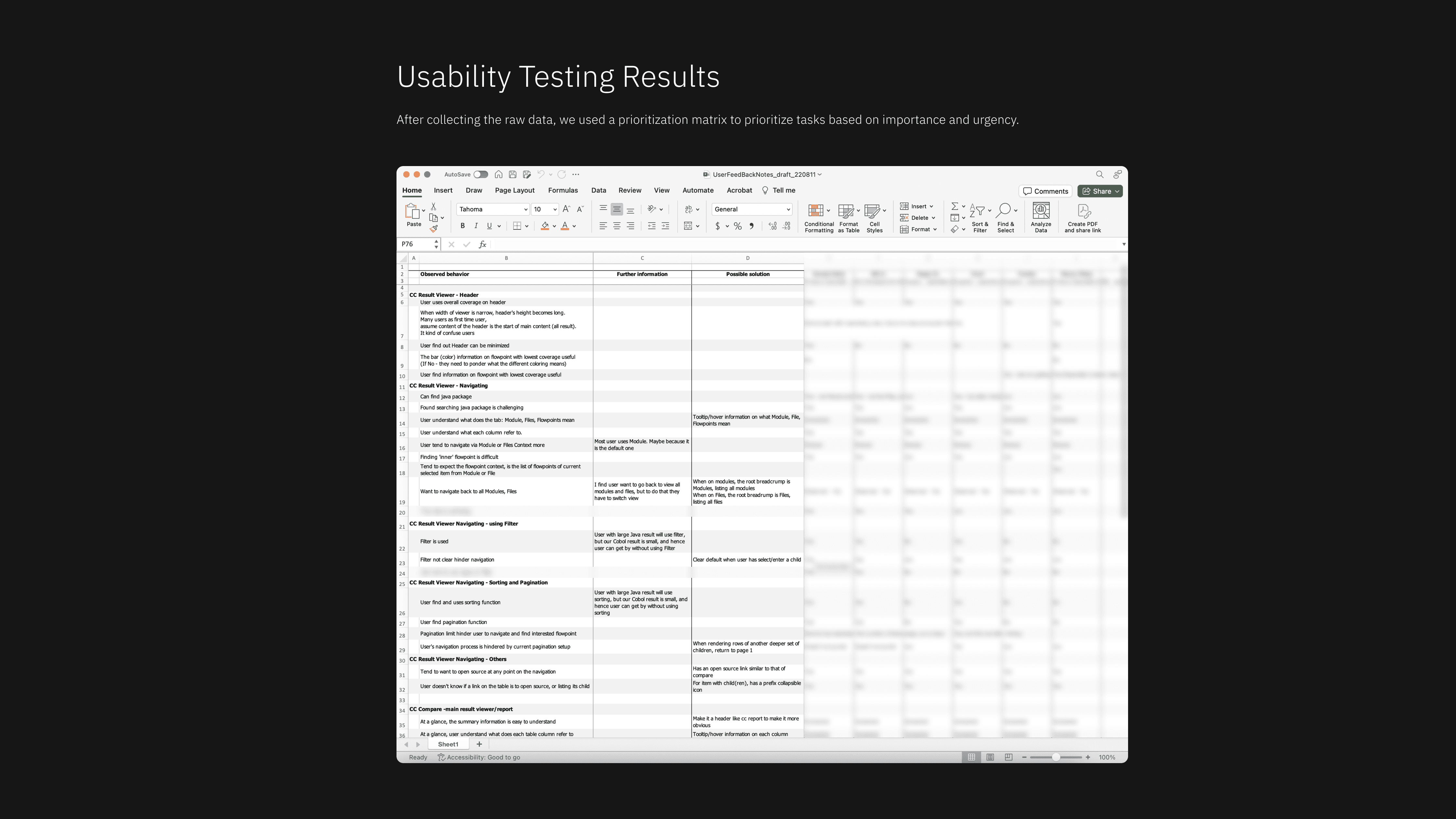
Usability Testing
Later on, we set up four user testing sessions with our clients to better understand their needs, frustrations, problems, and desires. We used this feedback to evaluate how certain proposed features may perform.
After consolidating our findings from the user interviews and testing, I had the chance to present at the IBM zSystems Demo. This demo is where employees from the DevSecOps pipeline gather to present work, receive internal feedback, and elicit buy-in from executives.


Personas
An archetype of a user that helps designers and developers empathize by understanding their users' business and personal contexts.
Outcome of Observations
Observing our users gave us the opportunity to empathize with their experience, understand their context, and uncover hidden needs.
The creation of personas allowed us to continuously consider our users' goals, needs, and frustrations during the design process to best serve them.

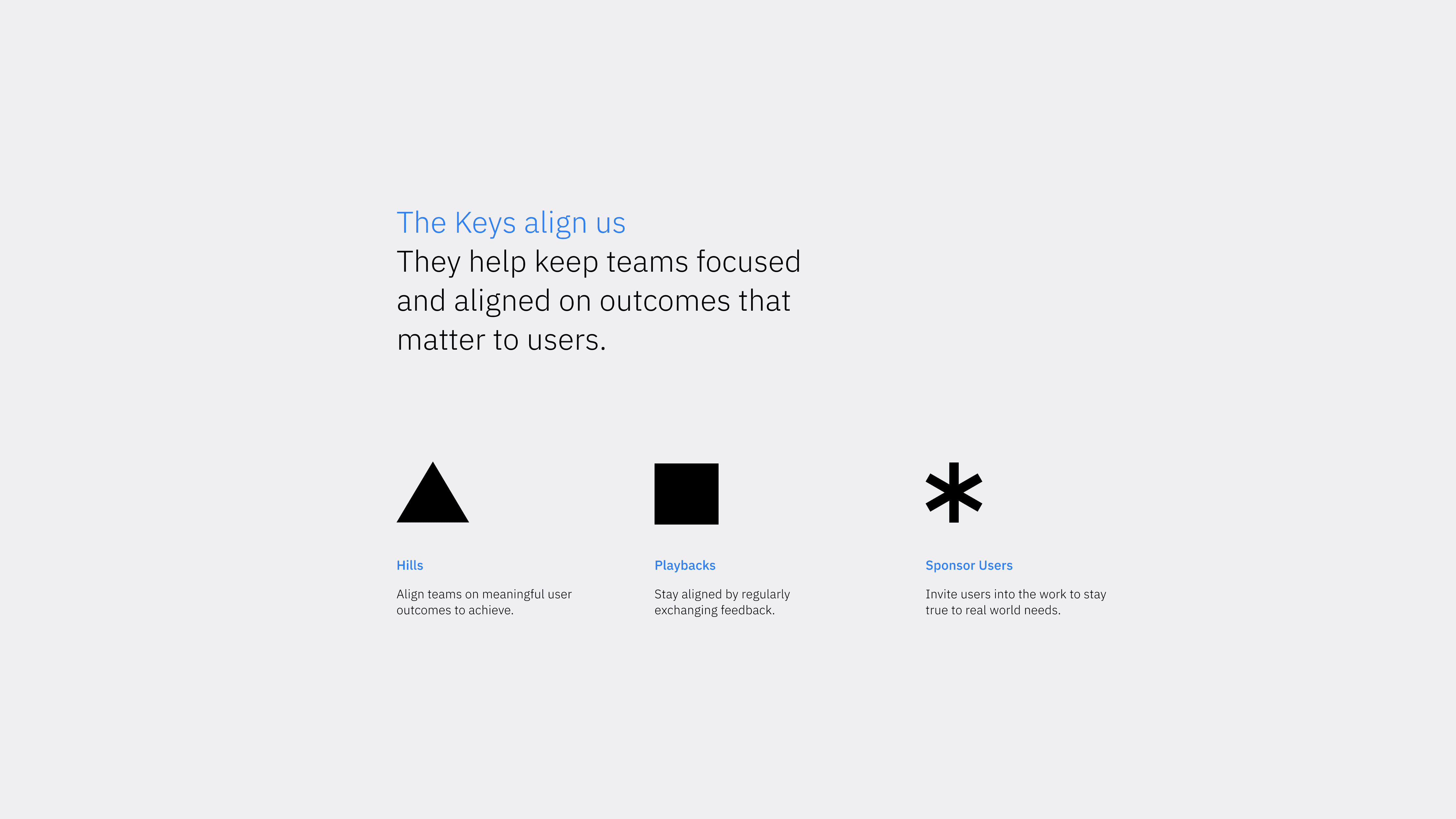
Hills
Hills are statements of intent written as meaningful user outcomes.
Statements
As a tester, I want to view my code coverage to identify areas for test improvements.
As a tester, I want to understand the code coverage for new code changes to ensure additional test cases are added where needed and overall coverage does not decrease.
As a developer, I want to understand the code coverage of my new code changes to identify if I need more unit test cases.
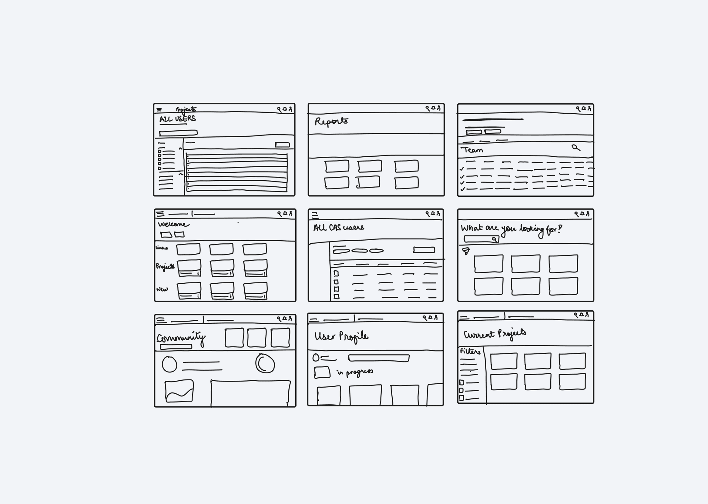
Lo-fi wireframes
Early lo-fi design artifacts lend themselves to quick and honest feedback.
Context
Utilizing low-fidelity wireframes during early user feedback sessions promoted the gathering of more authentic reactions and feedback because people recognized that we were in the initial conceptual phase.
Conversely, presenting a polished, high-fidelity design could lead users to believe that significant work has been completed, suppressing their willingness to offer criticism.
Mid-fi wireframes
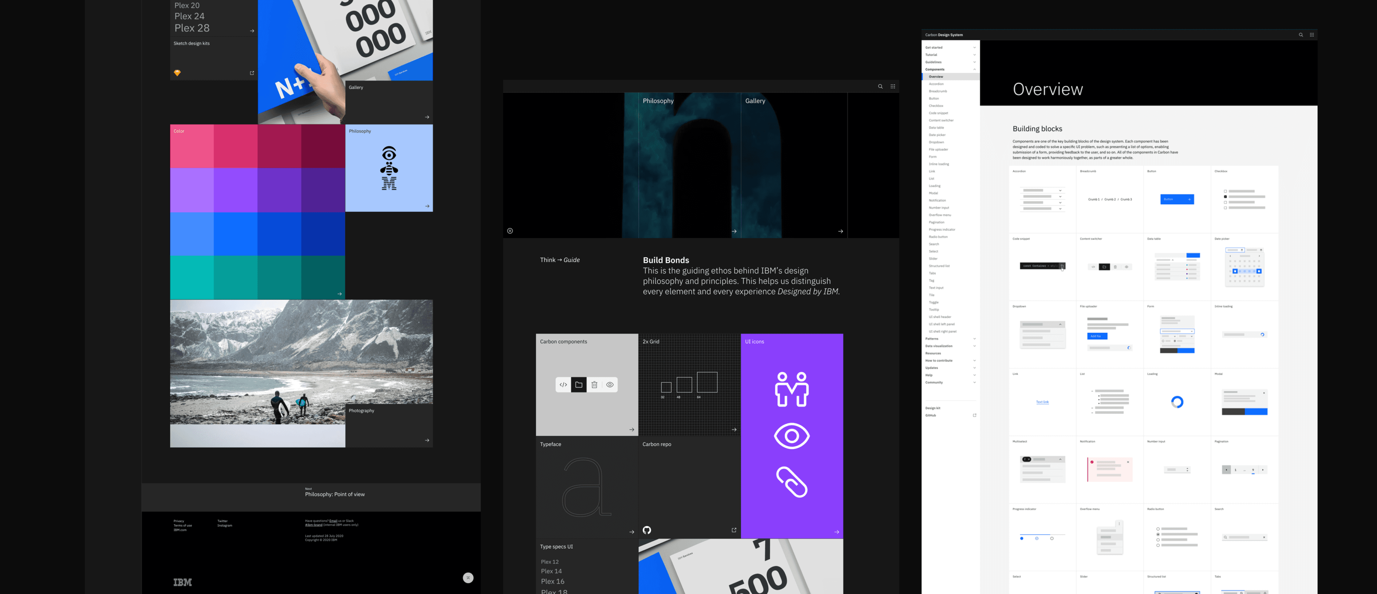
Implementing IBM's Carbon Design System.
Context
We began by finding the best native Carbon components based on our discussions and findings. We also made it a priority to ensure that no custom code would be necessary for the redesign.
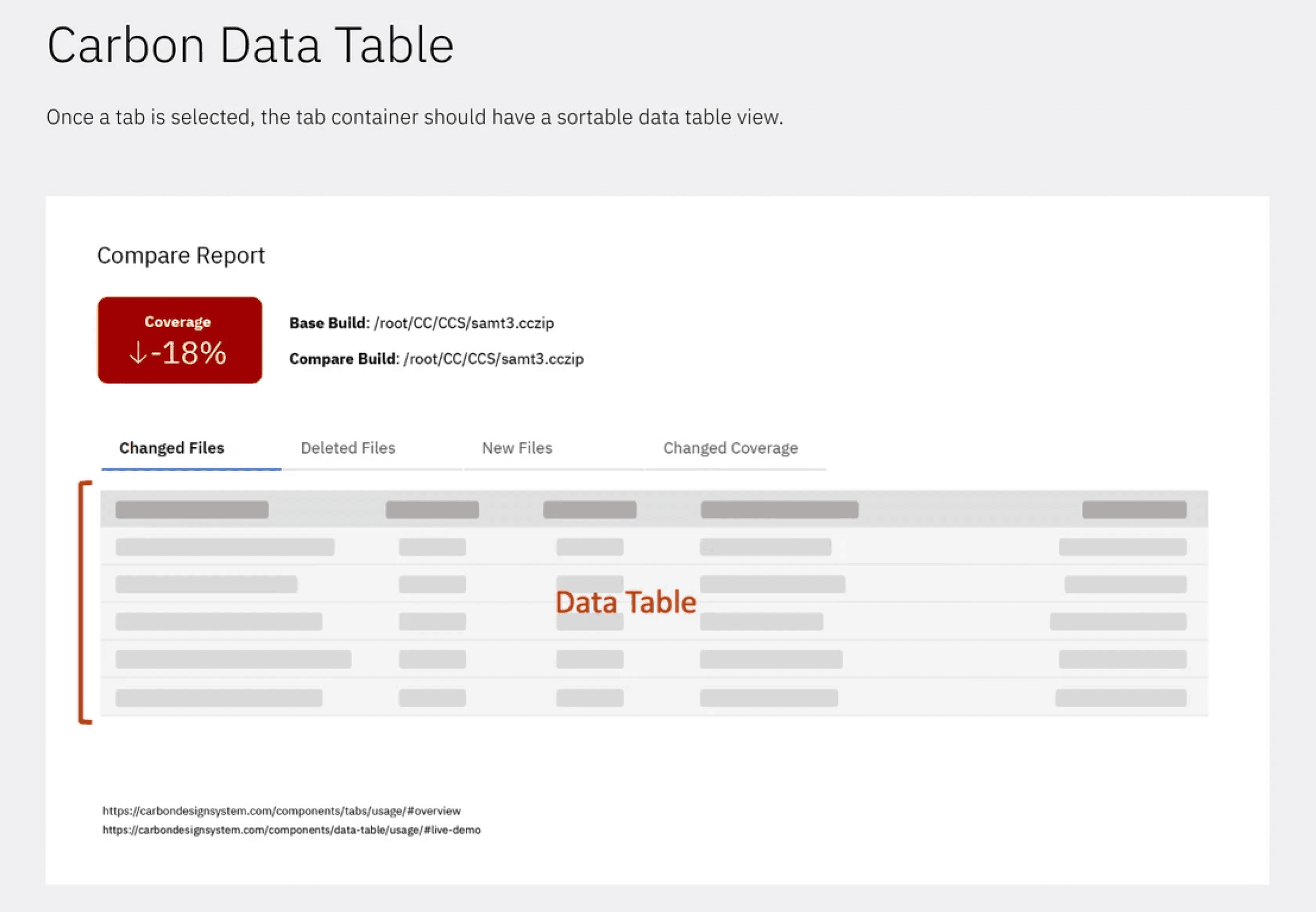
The three Carbon components we looked at focused on the quick filtering and organization of information: tabs, data grids, and accordions.

Playbacks
Playbacks bring stakeholders into the loop in a safe space to exchange feedback.
Context
Quarterly, stakeholders and IBM employees across the DevSecOps product pipeline gather together to showcase anything ranging from low-fidelity sketches to polished demos. The goal of playbacks is to tell a compelling story about our proposed solution and get meaningful feedback.
My contribution
While working on this project, I was able to present on behalf of the code coverage team to ~200 employees and stakeholders, sharing our research, design recommendations, and next steps.
The feedback that we received was then used to iterate on our hi-fi designs and prototype.


Usability testing
Conducting 6 usability testing sessions with our hi-fi prototype.
Context
The usability testing sessions were an evaluation of the product by testing it with representative users trying to complete common tasks. We asked participants to think out loud and complete survey ratings and questions.
My contribution
I was given the opportunity to host 3 of the usability testing sessions and supported the team via notetaking for the other 3 sessions.
Later on, we consolidated our findings and came up with possible solutions for each task that our participants encountered issues with.
Outcome
z/OS Debugger 16.0 — The outcome of our work.
My contribution
Based on our findings, I spearheaded the creation of the latest hi-fi designs and prototypes on Figma, along with development-ready specifications.
The final iteration that I was part of included revising the deliverables based on quality assurance and accessibility testing feedback.
Results
Now, not only does the code coverage user interface look more modern and sleek, but there are some new features to help users find information in reports a little easier.


Redesign
Code Coverage Report
About
For more information, you can take a look at the working with a code coverage report documentation.
Summary Section
The new summary section will allow you to quickly see the total coverage for the entire results. It's colour coded to indicate pass, warning or fail with green, yellow, and red respectively. By quickly scanning the colour in this section, you can tell if something is wrong with the result.
Grouping Data
There are 3 different ways to group data with the context switcher, which is just below the summary section. You can group by file, modules, or by flow points. Grouping by file or modules will let you navigate the result in a hierarchical way, giving you an overview of the stats at each level.
Navigation
Navigating the results are a lot simpler now. By default the context is set to file, so you see a list of files ordered by the lowest to highest coverage percentage. Click on the name of the file to navigate from file all the way down to the flow points.
Redesign
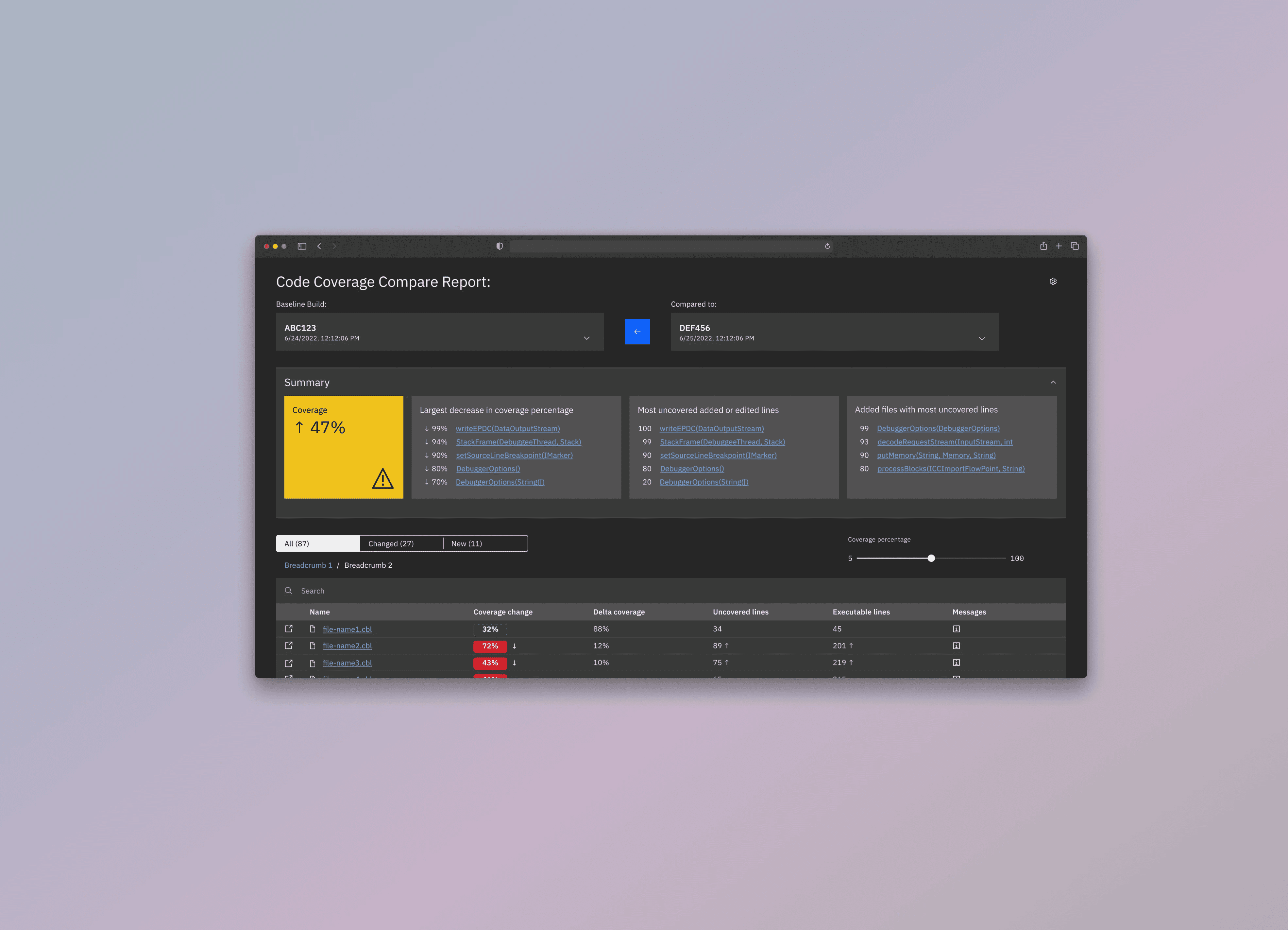
Comparing Code Coverage Results
About
For more information about the compare report, please see the documentation for working with a code coverage compare report.
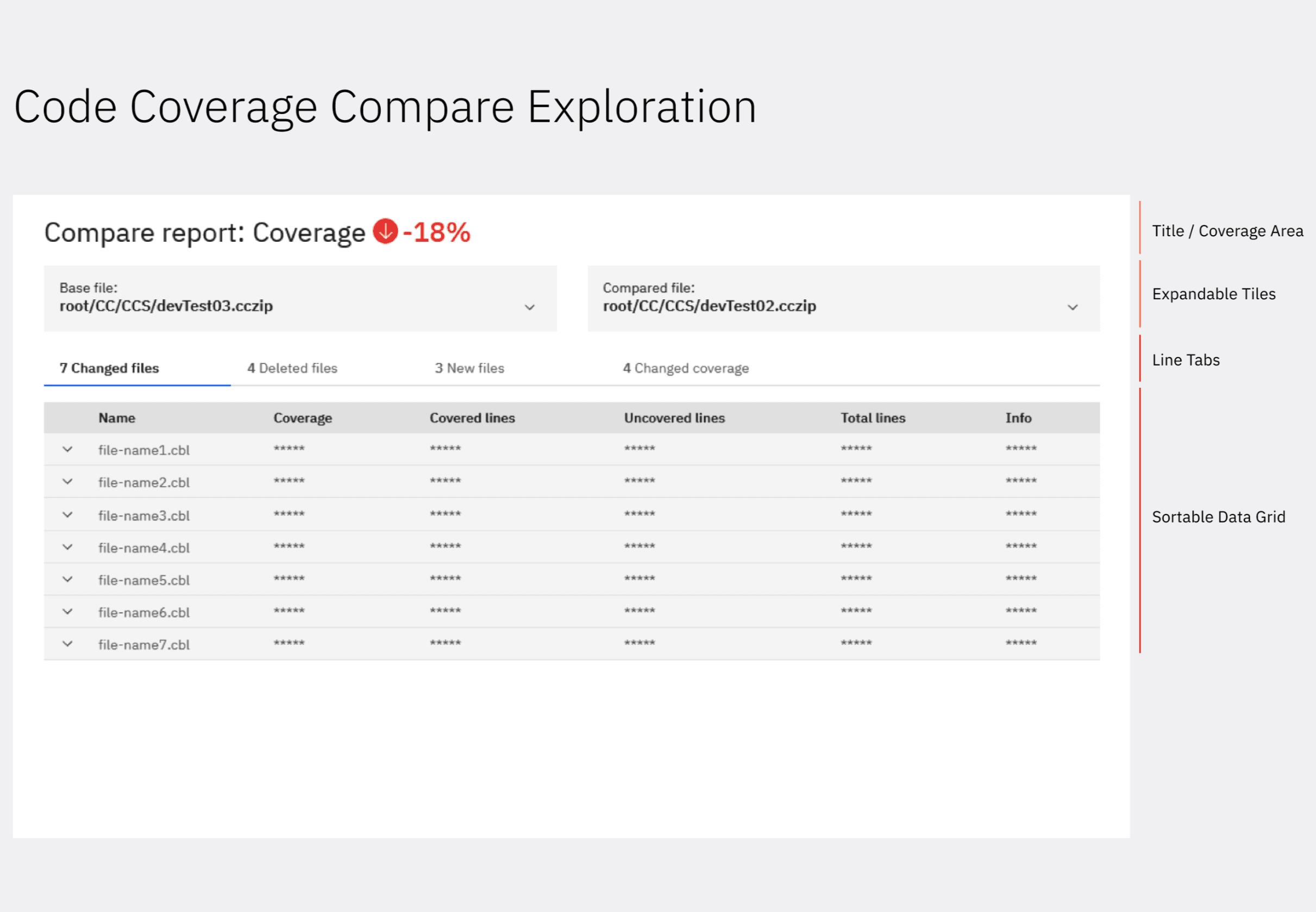
Compare Summary Report
There are two expandable tiles section that you can expand to see more info for each of the results. It will list stats such as number of files, modules, and # of test Ids etc.
If you want to swap the results around so that you are comparing the older one to the newer one, you can click on the build switcher button.
Navigation
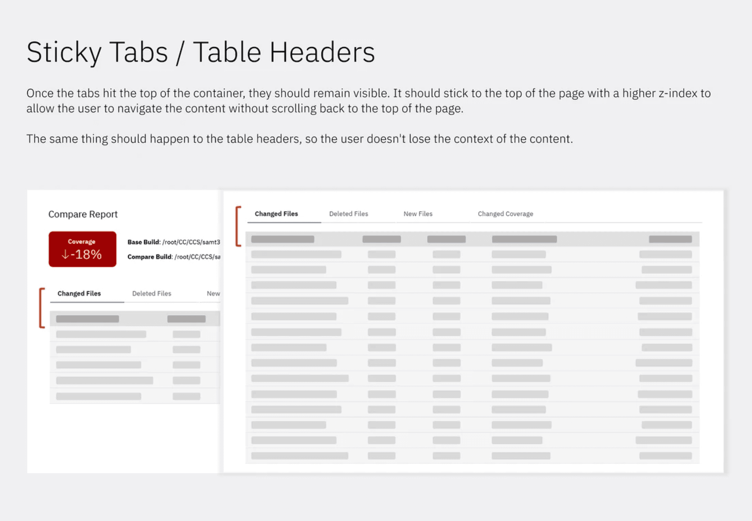
Navigation is very similar to the new code coverage report. Click on the name of the file/flow point to drill down into the result. There is now a view source button on the left that will open the source comparison report. Breadcrumbs at the top of the table will let you go back up to the parent.
Source Comparison Report
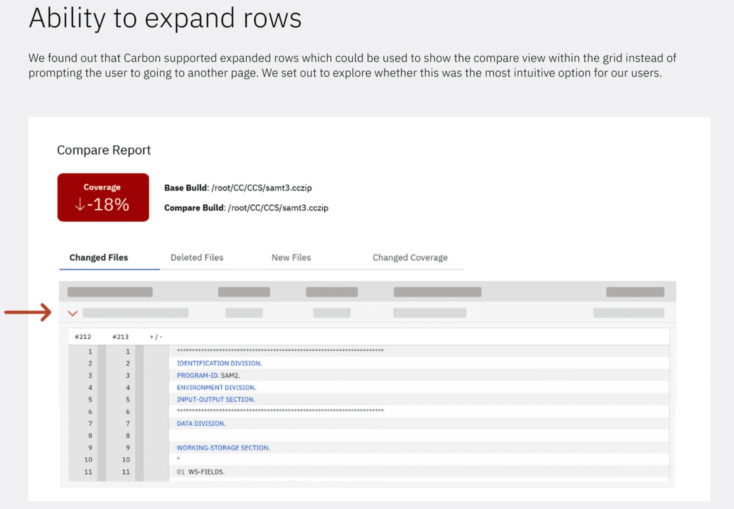
From the summary table, clicking on the view source icon will launch the source comparison report. This will allow you to see a source diff between the two results.
When you first enter the report, you will see all the flow points from this level of the result arranged into expandable/collapsable sections with the flowpoint that you're viewing expanded.